Music affects our mood, helps us express and process our feelings, and shapes our identities. Given the vital role music plays in our lives, we wanted to see if our text analytics software could give us some insight into how music has changed over the years. This analysis studied a range of songs from different time periods to see whether there are any particular trends in song sentiment over time.
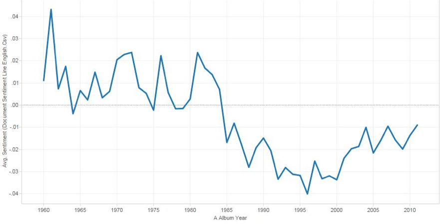
We ran a sentiment analysis on a database of nearly 145,000 songs lyrics ranging from the 1940s to early 2000s. Our initial results showed a significant amount of negative sentiment, particularly in songs from later years (Figure 1).
While this could lead to some interesting questions and speculations, we first delved a little further into the data for a closer analysis. After hand-scoring a few hundred songs, we began noticing that quite a few of them were difficult to classify into only one sentiment. Some would start out very negative (perhaps along the lines of losing their job, car, house, etc.) but end with an overriding positive line or two (say, “but then I found you and everything changed”). So here was a possible skew factor: perhaps the sentiment scores were not entirely representative of the data because many songs had mixed sentiment and our system simply detects slightly more negative sentiment than positive in them.
To address this possibility, we approached the analysis from a slightly different angle. We gathered sentiment line by line for each song and then took an average of the sentiment for the first and second halves. We then classified each song into a bucket based on its “sentiment topology” (positive-positive, positive-neutral, positive-negative, neutral-positive, etc.) and graphed these across time (Figure 2).
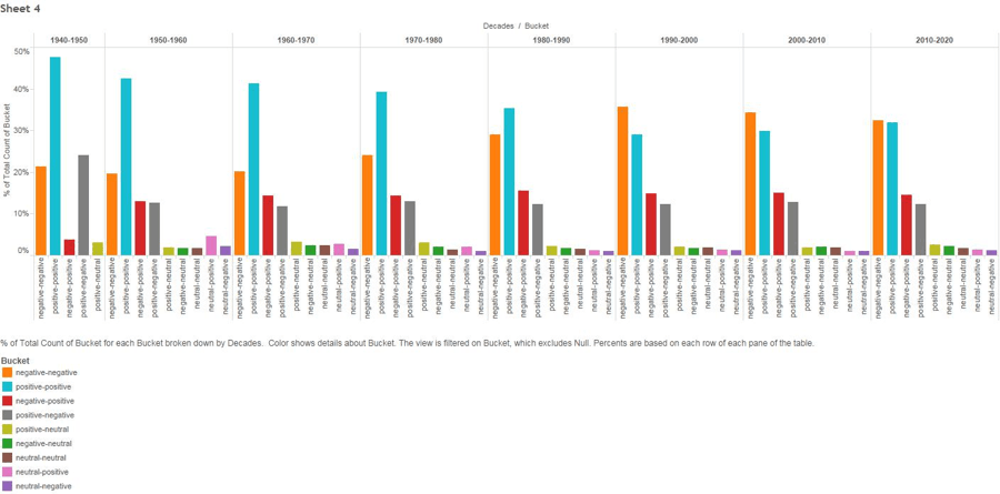
While there’s a lot going on in this graph, there are a few trends we found:
- Song selections from earlier decades comprised of far more positive songs than more recent selections, going from 47.65% of the songs from 1940 to 1950 to 28.96% of songs released from 1990 to 2000.
- Negative songs reached an apex in the 1990’s at 35.61% and then drew more level with positive songs from 2010 onwards with 32.5% of those songs being negative and 31.88% being positive.
- There were more sentiment-consistent songs than changing songs in the data set (i.e. more positive-positive and negative-negative songs than positive-negative or negative-positive ones).
Our more nuanced analysis shows that our initial conclusion—that song lyrics in general have expressed more negative sentiment—isn’t far off the mark. Our data shows that songs from the middle of the 20th century were overall much more positive than those at the end of the 20th and beginning of the 21st century. Over half of the songs we analyzed were, in fact, consistently either positive or negative, rather than switching between the two. Could this be a sign of a new pessimistic musical generation? Or perhaps a decrease of a “taboo” view around profanity and topics such as depression have led to greater exploration of negative topics.
There are a few next steps to move beyond this preliminary analysis into song sentiment. Increasing the number of songs would greatly strengthen these results. After all, there’s no such thing as too much data. Additionally, normalizing to ensure all musical genres are weighted equally will yield more “scientific” results, as would a look at the international music industry. Music is a complex field and though our analysis is preliminary, it’s pretty neat what you can glean from just a simple text analysis.